Tuesday, March 25, 2014

Mint (Collected) Life

The Creation:
When I was thinking of what to do for this project I got the idea to draw camera(s). This would fit in with my concentration of a "mint" life because I chose to define mint as being collective or a collected person. Mint could mean the mint condition of collector's items and not just a flavor of chocolate. The cameras and the person symbolizes the person's love of filming and taking pictures and collecting moments with a camera.

Sketches&References:


In Progress:


The Skills:
During this project I used pencil, pen, and ink. When I was drawing out each camera in pencil I drew it as a contour drawing. I thought of doing a contour drawing because drawing a piece that makes it rough looking seemed like a good method for the basis of the drawing. After I drew out the cameras and strips of film I used a fine point sharpie to outline the drawing. After that, I decided to use ink because I thought I could practice in that skill and also because I thought this media would fit the composition. When I was using the ink, at first the value was too dark. I fixed it by by adding more water. In this project I became more familiar with the ink media and with contour drawings.

The Risks:
For this entire project it had a lot of risks because just the idea of it was a risk. This is because I chose to do a contour drawing and ink. Concepts and media I'm not that familiar with. However, as I started with the contour drawings it turned out looking great. Then with the ink I practiced with a few strokes and tried it out on the final piece. At first the values didn't look good, but as I mixed the ink with more water the values were better and the piece was better.


Animal Piece


For this piece it was a mini project that my class got to do. There was a visiting artist that came to our school Bryant Holsenbeck, who created pieces, such as animals, using recyclable materials. For this project I made a panda and in sculpture class I made a monkey. Ms.Holsenbeck demonstrated how to make one. She first used wire to make the basic structure of the piece. After that we stuffed our wire pieces with plastic bags. Then covered it with strips of cloth which were tied by string. The animals ended up looking good.


Steampunk

The Creation:
For this project it was inspired by a steampunk design. Since the item that would be turned into a steampunk design was organic I thought of using an apple. I came up with the idea of using an apple because for my concentration I was focusing on a "dark" life. And in Snow White the apple symbolized the darkness that ended up harming Snow White. So I thought that this would be the perfect idea. One picture was the definite source of my pieces' creation because once I saw it I could see my drawing turn into reality.

References:


In Progress:


Global Awareness:
This piece was inspired by the steampunk style. Steampunk has been a very popular style in the 21st century. Throughout the nation and the world there have been many conventions and art pieces that has this steampunk aspect. Even movies such as Iron Man is demonstrating this pop culture event. As you look through my drawing you can see the mechanical and color aspects of steampunk embedded in the hand and the apple. To have a better understanding of steampunk I looked through some images online so I could draw the gears and other mechanical pieces better.

Reflection:
Before I started the piece I got the basic image I wanted to create. Then as I started I would at times test out techniques and colors, but when I know a certain method would look good in the piece I just drew it in. For instance, the stitches I drew in the hand were just added because I felt like something was missing on the hand's palm. This idea turned out well because it made the hand have more of a mechanical feel. Also, when I was drawing out my piece, I would stop working and look at the piece and find some inspiration that I could incorporate. For the hand especially because how the hand turns out looking either can make the piece bad or great. So at those moments that I took a step back, I looked at references to see other gears and mechanical parts that would make the hand look better. Another thing was that I would analyze if the colors I use and envision if that color would strengthen the piece.


Saturday, March 22, 2014

Hundertwasser Inspired

For this project I did a piece inspired by an Austrian artist, Friedensreich Hundertwasser, shown by my teacher. Before starting I looked up some of his buildings he designed and some art pieces he had done to get some reference on his style of art. I learned that Hundertwasser used mainly bright colors that is illustrated in a pattern. Also, it looked like, for his drawings, it was done in free hand and not with rulers. So I decided to do my piece ruler free. I did some sketches before finally picking out the one I would do.
Sketches:
               

References:
 

Throughout my project I looked at Hundertwasser's pieces to get inspiration on what else I could add to to my piece. For instance when thinking what to add for the background I thought of adding trees, but I didn't know how to draw it, so referred to one of his pieces and saw one that had trees shaped in a circle. I ended up drawing it in that style. Also, whenever I needed inspiration I would look at more pieces of the artists work, ask for advice, or just think of concepts related to my concentration and incorporate it in my work.

In Progress:
                                                             

Collaboration:
Throughout this project at times I felt like I didn't know what to add so asked my teacher and some of my classmates for some advice. This is the project where I asked for suggestions the most and that made this piece turn out to be one of my most favorite piece. For example, the building on the upper right corner I got the idea of coloring it grey, blue, and black from a classmate. She told me that it would balance the piece since there was already a warm, cool, and neutral color. Also, the horizon line at the very top and coloring the central tower and not leaving it white were some of the suggestions given and what I decided to incorporate into my piece. The horizon line made the piece look like it wasn't floating in air and the colorful tower made everything somewhat connected.

Reflections:
For this project I would step back and analyze this piece whenever I needed inspiration. I would look at the piece from a distance and see what would make it even better. Then, most of the time I would just add something on a whim and it would turn out looking good. But at other times I would first test it out on a sheet of paper so I would see if it would fit the art piece and so I wouldn't mess it up as well. For example, when I would decide what color to use I would first color out a small section on a scrap piece of paper and see if it would fit.


Wednesday, March 19, 2014

Animal Study - Tarsier

Before
For this project I chose to do a tarsier using colored pencils for my animal study This animal is native to the southern islands of Asia. I wanted to draw this animal because it's not an animal everyone knows of. Before starting I knew that coloring the fur in would be one of the hardest parts of the piece because using the right technique for coloring the fur in would give the best results.
References
                                                                                                                            

Start to the End
I started by getting an outline of the picture.Then I thought I should do the background first before actually doing the animal. After the background was done, the animal was next. It was hard to start at first but as I knew what strokes worked best, the rest was easy. I decided to draw two tarsiers so I would be doing an original piece and not copying some pictures exactly. These two pictures (Top & Right) were the pictures that inspired my work, but by adding my own image of how their environment looks like, the piece looked more original. Overall the final piece looked really good. The background and foreground was good, however the mid ground of the piece was my least favorite part because the transition from the front view to the back did not seem smooth. Other than that I thought this piece was wonderful.


Reflective Drawing

Before
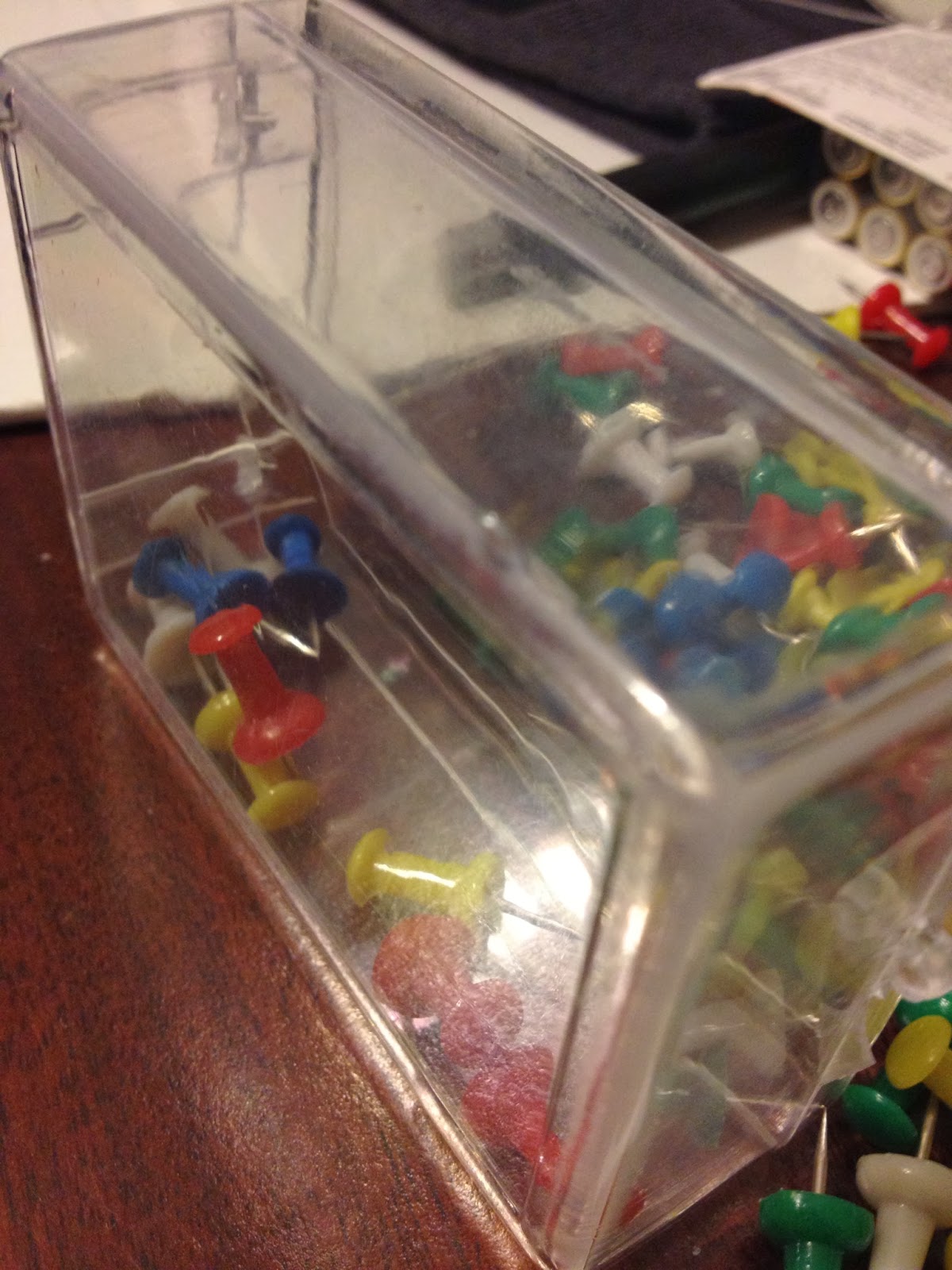
         For this piece I decided to use a picture I took of thumbtacks and its case. I chose this because of its' "reflectiveness" and the colors the tacks had. Once I had my idea I practiced drawing and coloring the picture.  The video we had watched prior to starting also helped me know where/how to start. The lady from the video gave me the idea to trace the image's outline so I could have a basis to start my coloring with. Also, so I wouldn't have to worry about whether or not the drawing was accurate enough.


Original Picture


Start to the End
          After getting the outline, putting on the colors was pretty easy. When I was doing the reflective parts of the drawing you couldn't really tell if the tacks were inside the box or outside. With the advice from my teacher I made the colors more lighter or darker and added a shadow to the thumbtacks so the image would look more like it was popping out. I also put on some purple and blue on the thumbtack case so it wouldn't look plain. From the two images below you could spot the differences from before I added more dark shadows to the one after I added them.

        Other problems I faced was coloring the table because it didn't look like it was colored or blended well, so I just kept coloring it brown and adding shadows and highlights. Eventually the piece was looking good.
         This Project taught me how to use prisma colored pencils better. Before when I used these colored pencils I didn't push myself with darkening or highlighting certain areas. Also, on layering the colors. By learning how to layer and blend the colors the piece began to have more depth and was looking better with these improvements. Pushing myself to put more extreme values of color and not just mid range values helped me improve in this media. Also, with what I learned in this project I started to apply it to my other projects. As you look at my other works.
                                                                                                                                                             

Friday, January 10, 2014

Art IV - Proj. VIII

Planning


Brainstorming

For my 8th project I chose the theme for "Along for the Ride." The concept I came up with was a paper boat going down a stream and a kid watching it. For the media I thought of doing it digitally since I have not done one yet. I would be using an iPad to draw out this scene because the digital finger painting of Morgan Freeman inspired me to do one. That drawing was amazing that at first I thought it was just a photo, up until I saw the video and the process the person did to make the digital painting..

Reference Photo


In Action & Results

I first drew a picture, but it had evolved compared to the original concept. It stilled had the paper boat idea and the kid but this time it focused more on the boat and it only shows a kid's rain boots, implying that it's a kid playing on a rainy day. Then as the sketch was finished, I started to use the iPad. At times I struggled on what I should do or color next but as I chose colors, everything turned out pretty good. As I saved each step and was finished, I liked seeing the progression from the pencil drawing to a more detailed piece. For future improvements maybe I'd change or make the umbrella and rain boots better or into something else.

The Process:


"A Rainy Day"